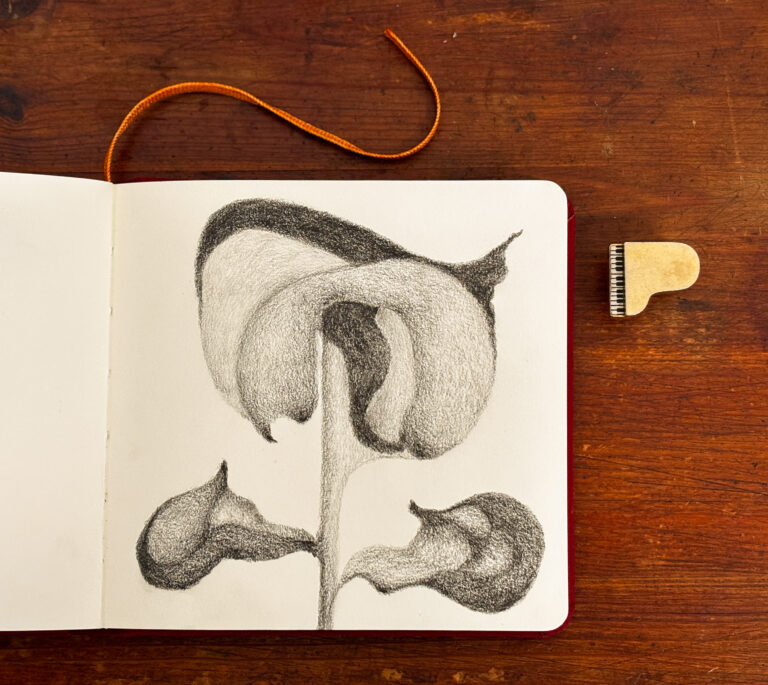
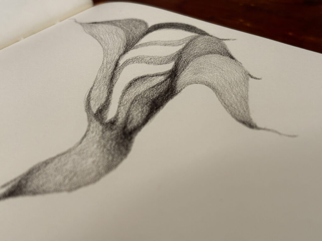
For the first time, I decided to try out a pencil from a different brand, and I love the results. I usually use Staedler pencils for these abstract flowers, but in this case, I used a Faber-Castle I recently purchased on a whim. I cannot exactly explain the difference between the two except that the Faber-Castle had a certain lightness to its touch on the paper, however vague that sounds. In any case, I will try it out on a few more flowers and see how it holds up.

I wanted to highlight the contrast between white and everything else with this flower. It is quite a stark difference, but I am okay with that. In fact, I may experiment with it more.
I marvel at the biological engineering behind the ability of a single stem to carry such a heavy load quite gracefully. This phenomenon is commonplace in nature, and I mimic it with this flower’s paltry, but mighty, stem.
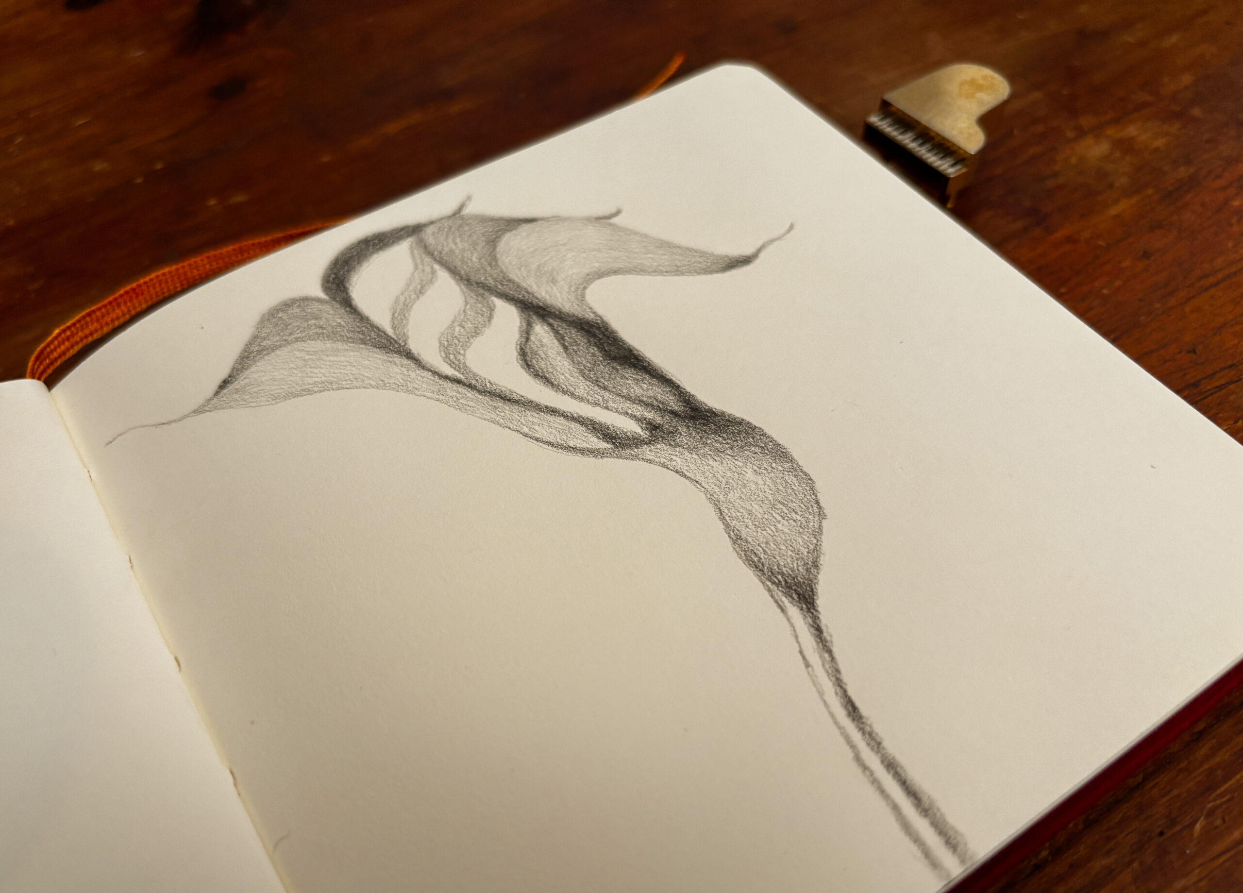
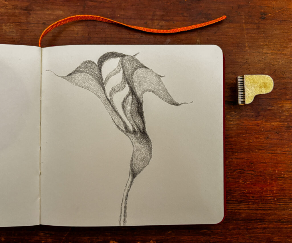
It is apparent to me that in nature, at least, there are no straight lines. I only see curves and waves everywhere. I see them in the ocean, in billowing clouds, in a cat napping, and in the lilting of flowers.
When we curve, we bend.
We sway.
We dance.
Where would we be without our curves?